Friday, April 14, 2017
Judging Marvels July Books By Their Covers
Judging Marvels July Books By Their Covers
Marvels July Solicitations are up, so lets make some prejudgements based just on the covers (as we all love to make prejudgements, dont we?).
Lets begin!
___________________________________________________
I didnt expect him to duplicate the strong cover effort from last month...
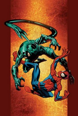
but damn, couldnt he have at least TRIED?
___________________________________________________
"this is the explosive climax to the amazing series of events that go back to Mark Millars first issue"?!?!
NOO!!!
HOW CAN WE GO THAT FAR BACK!!
It is too much!!
12 ISSUES IS TOO FAR BACK FOR ME TO REMEMBER, EVEN FOR AN EXPLOSIVE CLIMAX!!!
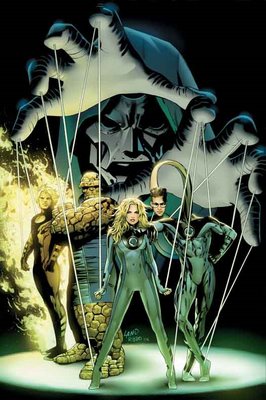
Pretty pedestrian cover, too.
___________________________________________________
Ugh. Tom Raney appears to be doing the "washed" look with his pencils.
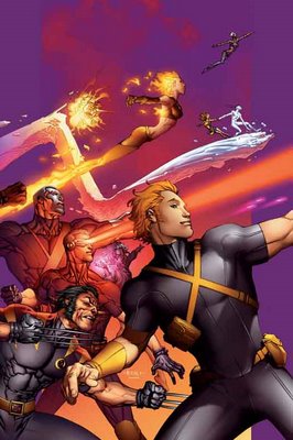
I do not approve.
___________________________________________________
CIVIL WAR COVERS!!
___________________________________________________
Man, Steve McNiven makes being annoyed at Civil War difficult, because hes so talented.
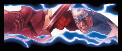
Great cover, although this scene better damn well appear in the issue!
Luckily, Michael Turner is there to make it easy to make fun of Civil War.
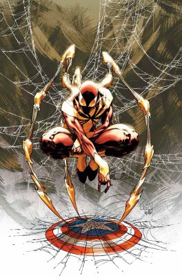
Although, isnt it funny to see a costume design that is actually BENEATH Turner?
___________________________________________________
Due to the ugly trade dress, Civil War covers are automatically disqualified from Top Five consideration, but if not, this Juan Doe cover for Civil War X-Men would be a top contender.
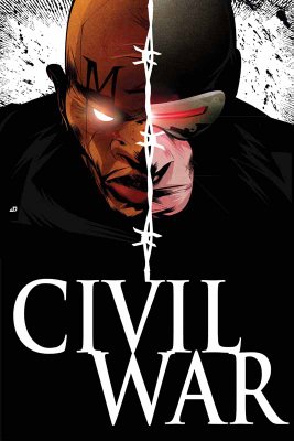
Very strong cover image.
___________________________________________________
Wow.
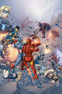
I think this is one of the best arguments against photoshop comics. This Civil War Daily Bugle comic looks less like a cohesive drawing and more like a photo collage.
___________________________________________________
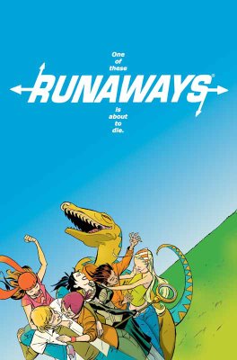
Is it just me, or does Cheungs art for this Young Avengers/Runaways mini-series cover...
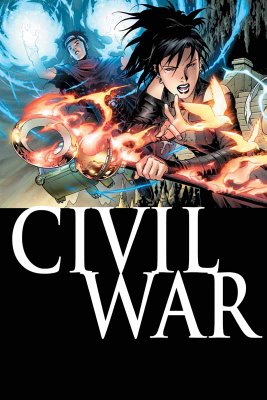
look a bit regressive? It looks more like his X-Force style than his post-Scion stuff, no?
I bet Rich Watson can tell me (completely obscure reference I should not have made, sorry, folks)!!
___________________________________________________
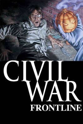
I like John Watsons work a lot, but this Civil War Frontline cover is a bit goofy looking.
___________________________________________________
Man, wasnt Waid and Garneys Captain America awesome? The book is in capable hands at the moment, but I bet Waid and Garney could do something ELSE cool.
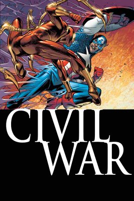
Oh, by the by, the solicit for this issue? "When one of the Wars leaders comes to recruit Spidey for his troops..." Which one could it be?!!? I love a mystery!!!
___________________________________________________
I am pleased that they are allowing the Black Panther/Storm wedding to be without the yucky trade dress.
Nice cover, except the dress.
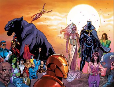
Luckily, Michal Turner is chipping in on a variant cover.
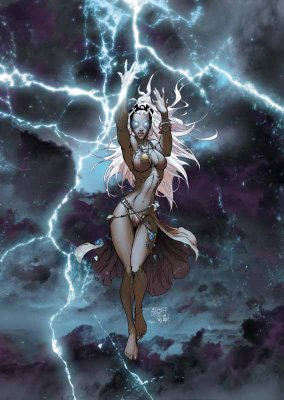
Yep, nothing says "wedding issue" more than a half-naked lady in the rain!
Turner - All class.
___________________________________________________
You know what Civil War needs more of?
People standing with their arms folded!!
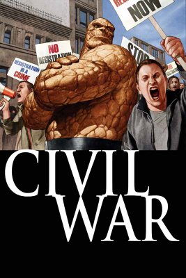
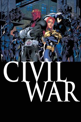
Oh.
Never mind.
___________________________________________________
Ryan Sook is a really, really good artist.
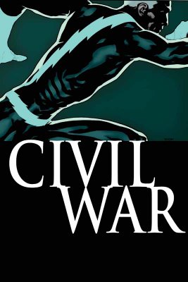
Nice cover (except, of course, the silly trade dress).
___________________________________________________
Man, what an awful Cable/Deadpool cover by Roberto Campus!!
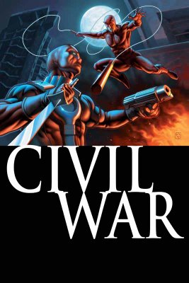
Is Deadpool glowing?
That is barely recognizable as Deadpool!
And the Daredevil aint that good, either.
___________________________________________________
I like Leinil Francis Yus art a lot.

That being said, this New Avengers cover is kinda lame.
___________________________________________________
Ooooh...now Nitro has Wolverine!!
Remember when Justice League International did that with Lobo and Guy Gardner?
That was cool.

This is less so.
No giraffe neck, though!!
___________________________________________________
I really admire the way Friendly Neighborhood Spider-Man lately has tried to avoid the crossover crunch, and stand on its own.
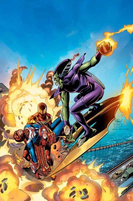
Also, nice cover by Ringo.
___________________________________________________
Man, that is one creepy looking cover.
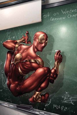
Clayton Crains work scares me.
And I dont want to know where he got the photo basis for this cover from!!
___________________________________________________
Pretty low-key last issue of Last Planet Standing.

___________________________________________________
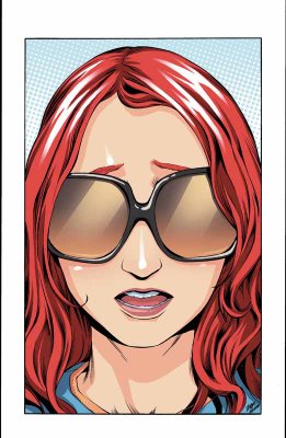
Wow, that is probably the most boring Mary Jane cover Ive seen yet.
___________________________________________________
This is a very nice cover as both a last issue AND a 100th issue.
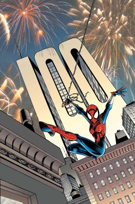
Theres no mention in the solicits of Sal Buscema, though. I hope hes still on board.
___________________________________________________
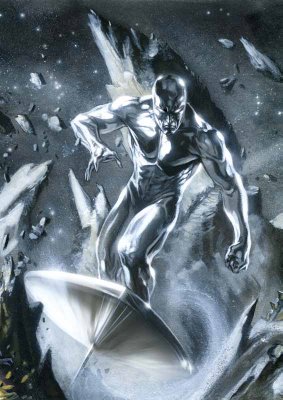
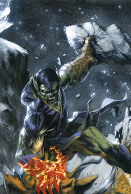
ANNIHILATION COVERS - NOW INTERLOCKING!!!
Its funny, though, THESE covers are interlocking, but since most of Gabriele DellOttos covers have looked basically the same ANYways, this is not exactly osmething new.
I dont like the new Nova costume...

I like how somber Ronan looks...

Nice Silver Surfer...
Best Super Skrull Ive seen from DellOtto yet!!
___________________________________________________
HA!
I love it!

The grim and gritty Power Pack!
Classic idea!
___________________________________________________
Very weird poses.
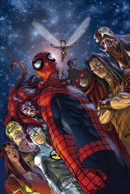
But since I love obscure Marvel characters, Im down!!!
___________________________________________________
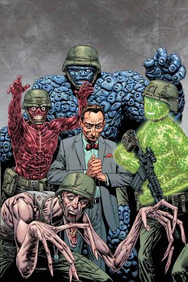
Pretty decent Fantastic Four: First Family cover by Chris Weston...
___________________________________________________
Nice drawing by John Romita Jr. (as usual)...

however, its not exactly a striking cover.
___________________________________________________
The same thing can be said for this Tex Ghost Rider cover.
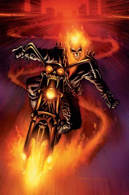
Then again, Tex at least has the benefit of following Clayton Crain, which will make people be happier to see his cover.
___________________________________________________
Iron...
Maniac.
Iron Maniac.
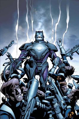
This is what I love about Kirkman. Its just SO stupid that he manages to sell it!
___________________________________________________
MARVEL ADVENTURES COVERS!!
___________________________________________________
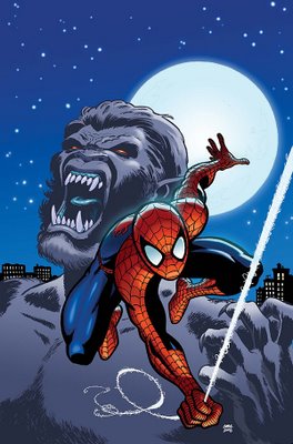
Wow, this Marvel Adventures Fantastic Four looks like the most generic cover ever!

___________________________________________________
Oops...I spoke too soon!!!
___________________________________________________
I like Aaron Loprestis art...

but not that Giant-Girl costume.
___________________________________________________
Theres scary.
And then theres unintentionally scary.
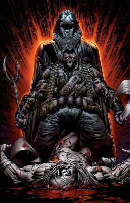
This cover nicely pulls off both.
___________________________________________________
First disappointing cover for Frank Cho (well, outside of his absurd #1 cover).

Too bad, I was really impressed with his last two covers.
___________________________________________________
Tsk tsk.
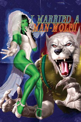
One of the few times that the cheesecake cover motif WORKS, and Horn has to blow it by putting a picture of a wolf on the cover and then pretending that he is drawing a werewolf.
Poor form, Mr. Horn, poor form.
___________________________________________________
Gary Frank is an AWEsome artist.
However, look at this Squadron Supreme cover...
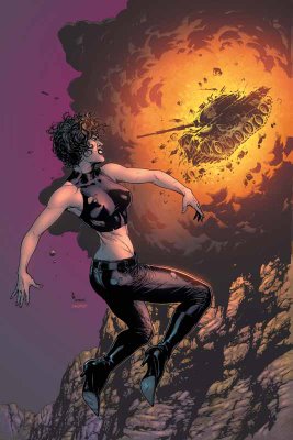
DAMN, his Squadron Suprem covers are boring!
___________________________________________________
Luckily, his Fury Peacemaker cover, while still being fairly static...
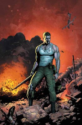
has enough attitude to pull the cover off.
___________________________________________________
COOL WRAPAROUND COVERS BY NEW X-MEN CREATIVE TEAMS!!
___________________________________________________
First, Billy Tan on Uncanny X-Men...

Next, Chris Bachalo on X-Men...

I would have put both of them in the Top Five, except that they really only REALLY impress me because my expectations were lowered so much...so not enough for top five!!
___________________________________________________
Seriously, New Excalibur has got to quit with these covers.
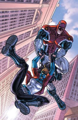
Its like theyre in a Mentos commercial, the way everyone is so freakishly giddy.
___________________________________________________
This is an impressive Storm cover by Mayhew.

___________________________________________________
I like Paul Pelletier.
This is a nice drawing.

A bit subdued for a cover, though.
___________________________________________________
You can debate the merits of Paco Medinas pencils (which seem to tighten and loosen from issue to issue)...
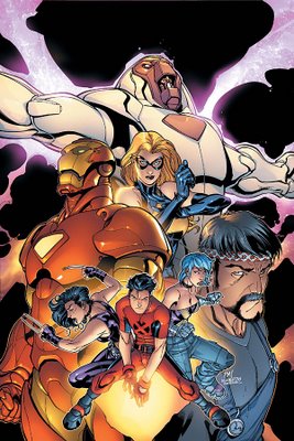
but you have to admire his cover design sense.
___________________________________________________
What an odd decision by Quesada...
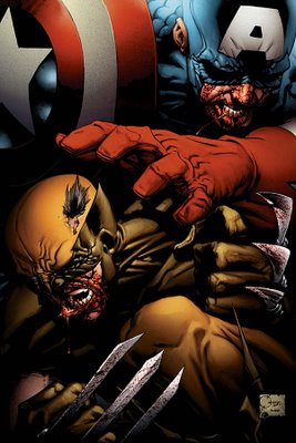
its like hes trying to draw them like Sin City.
Weird.
___________________________________________________
Another colorform cover by Bradstreet!

Detach - move - apply.
___________________________________________________
I like the idea behind the Halo cover.
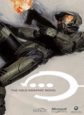
You dont need a fancy cover, just slapping "Halo" on the cover is probably enough to sell the comic.
___________________________________________________
Pretty good Jack Kirby cover.

I dunno about the concept, though.
___________________________________________________
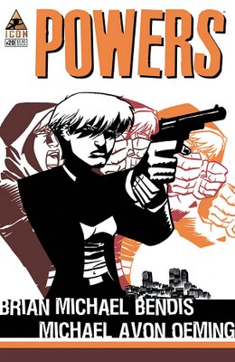
Nice cover design by Oeming.
___________________________________________________
HONORABLE MENTIONS (really nice month for covers, so theres a lot of them)!!!
___________________________________________________
ERIC POWELL COVERS!
He is awesome.
These covers for Marvels Western one-shots are awesome.

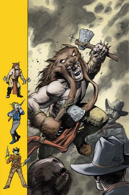
A lighter month, both easy top five - but once I kept out one, I couldnt decide which one to keep, so BOTH became honorable mentions!
___________________________________________________
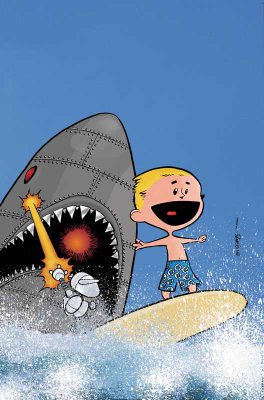
What a perfect encapsulation of the fun that is Franklin Richards, Son of a Genius!!
___________________________________________________
This reminds me of the super-sweet Dave Gibbons cover for this months Action Comics.
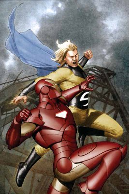
Great job by Granov.
___________________________________________________
Off month for Nextwave.

I expect greatness every month!
___________________________________________________
This coloring book incentive would be a guaranteed top five...
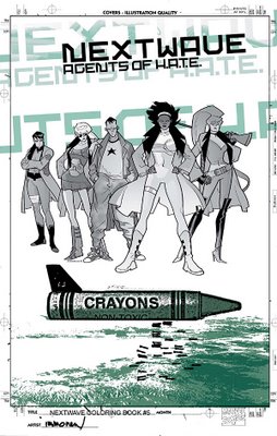
except it looks just like a black and white version of the original cover!!
What gives?!?!
___________________________________________________
MAN, do I loves me some Marcos Martin.
I cant wait until he draws Doctor Strange!!
However, this cover is a bit too weird for me to make top five. I still dig it a lot!
___________________________________________________
It was SUPER close between the two Ladronn covers (heck, all the top six titles I could be convinced to mix around)...but since this on is a bit more of a static cover, I put this one (for the Handbook) in the honorable mentions.
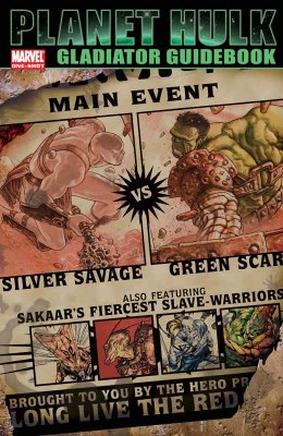
Great cover, though.
Ladronn rules.
___________________________________________________
TOP FIVE COVERS!!
___________________________________________________
5. Claire Wendling is an excellent artist.
This is a great cover for X-Men Fairy Tales.
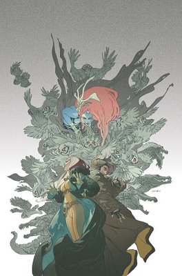
Last month, it was Kyle Baker, this month it is Claire Wendling!
Whos going to draw a cover next?!?! H. R. Giger?!?!
___________________________________________________
4. How freakin badass is this Ladronn Hulk cover?!?
Its like its leaping off of the page!
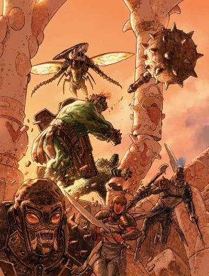
Amazing.
___________________________________________________
3. Steve Epting has delivered some really strong covers for this arc.
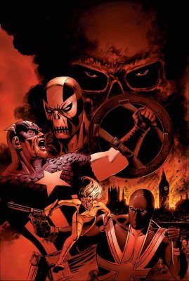
This might be a little high, but I feel bad for excluding him from the top five in the past.
Still, great cover, no?
___________________________________________________
2. David Mack is a design genius.

An amazing cover.
___________________________________________________
1. Finally, Richard Corbens covers for House of Horror: Edgar Allen Poe have been awesome, but for this cover...
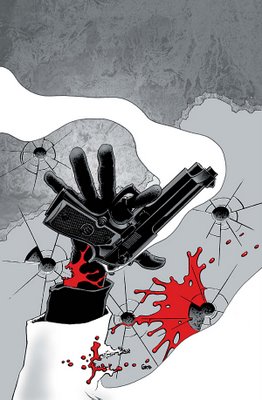
he amps it up a notch!
What an amazing design, and he pulls off the design flawlessly.
What a great artist Corben is.
___________________________________________________
Well, thats it for this month!
Feel free to weigh in with your prejudices (and your top five covers)!
Read More
Available link for download