Friday, February 3, 2017
Judging Images July Books By Their Covers
Judging Images July Books By Their Covers
I sometimes forget about Images solicitations, but since theyre up, lets make some prejudgements based just on the covers (as we all love to make prejudgements, dont we?).
Lets begin!
___________________________________________________
A pretty decent City of Heroes cover...

but Im not photo-realism fan.
On a side note, if you want to be credited a certain way, I think the company should credit you that way, unless youre asking to be called, like, "Fuck You Jones" or something equally offensive. If you want to use a pseudonym, they should let you use the durn pseudonym!!
___________________________________________________
I really enjoy Death, Jr., so Im glad theres going to be a sequel!
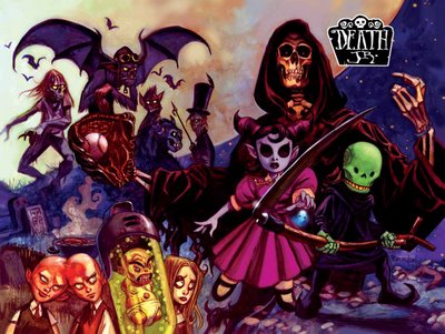
However, why not let Ted Naifeh do the covers?
___________________________________________________
Not a bad Battle Pope cover...

but I think it encapsulates my main problem with Battle Pope. Way too slight of a story.
___________________________________________________
Question regarding the solicitation for The Psycho...

Was "The Psycho" really a "classic" DC series?
___________________________________________________
Come on now, I cant be the only one out there...

...who wants to see Occult Crimes Taskforce crossover with Tek-War, can I?
The character based upon Rosario Dawson and the character based upon William Shatner would have some cool chemistry, I bet!
___________________________________________________
It is good to know that Brian Stelfreeze is in better condition nowadays.

Although...The Ride? Really, Mr. Stelfreeze?
___________________________________________________
Damn.
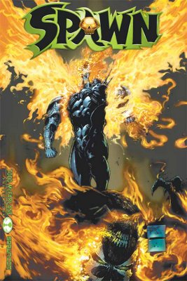
Billy Tan needs to hone up on the storytelling skills department.
___________________________________________________
A fairly generic cover for Task Force #1.

Now that I think about it, "Task Force" is also a pretty generic name.
___________________________________________________
Giuseppe Ferrario manages to get as much humor as he can out of this concept..

Its not a lot, but its something.
___________________________________________________
Pretty striking cover.

But it only really works if youre already a PvP fan.
___________________________________________________
Is there REALLY a market out there for the Shadowhawk story from the Image Anniversary Hardcover?

Really?
___________________________________________________
I dont know whats going on with this book, but it looks sorta interesting.

___________________________________________________
This is a fairly intriguing concept for a cover.
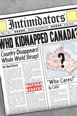
Not THAT intriguing, but still, its something.
___________________________________________________
Heres what I dont get...

Why bring in another artist just to draw that cover?
Not a bad cover, but Doug Tennapel couldnt draw that himself?
___________________________________________________
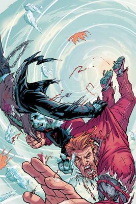
Pretty nice action cover for Noble Causes.
___________________________________________________
Thats a great drawing of whatever it is, but whatever it is isnt interesting enough for a cover.

Negative Burn rules, though.
___________________________________________________
Pat Lees art looks better when he isnt drawing human beings.

So this is okay for him.
___________________________________________________
This cover for the Godland tradepaperback is actually fairly disappointing...
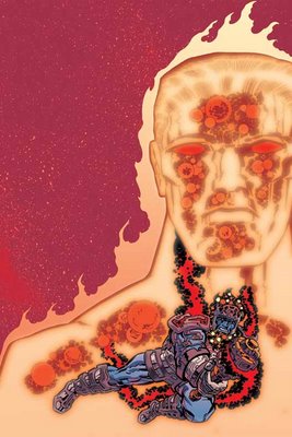
Not a lot going on there.
___________________________________________________
I love Ladronn, but his cover for this Hip Flash comic is too dark for my tastes...
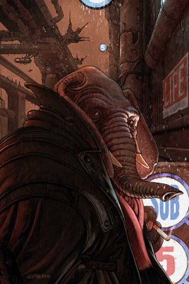
___________________________________________________

How bland is that cover?
___________________________________________________
The Emissary.

Is this Ferreyras current project, or is he doing this AND Rex Mundi?
___________________________________________________
MIKE HAWTHORNE COVERS!!
First, Umbra...

Pretty nice layout.
Next, Hysteria: One Man Gang...
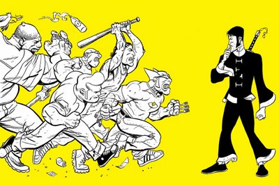
I love funny covers!
___________________________________________________
When you look at the covers of Girls, dont you just say to yourself, "Ah...the Luna Brothers...remember that awesome Ultra series they did?"

Then you open up the comic, and it all falls apart.
___________________________________________________
Not a BAD cover...

...but every apect of this cover just seems to be a bit...OFF. Especially the faces.
___________________________________________________
I get the concept of having a consistent cover layout...
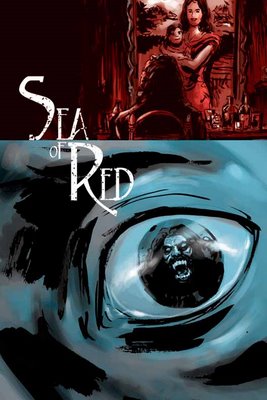
but I dont agree with it. Too much sameness is never a good idea, I say.
___________________________________________________
Strong Remender illustration for Last Christmas...
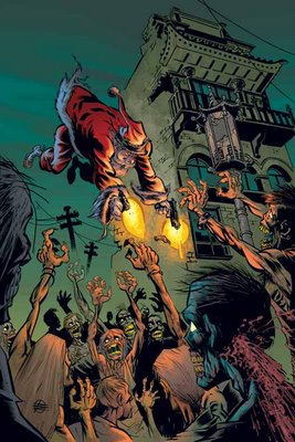
but Im not sure if it works for a cover (not shown this month, because it was solicited a few months back, is an EXCELLENT Tony Moore cover for Fear Agent).
___________________________________________________
Strong visual by Rafael Albuquerque.

I think it is hurt by our unfamiliarity with the character.
___________________________________________________
That is one boring Invinsible cover...

___________________________________________________
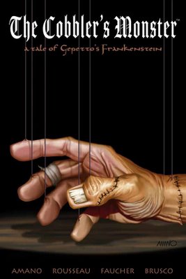
This is a pretty sweet Jeff Amano cover for this Cobblers Monster Graphic Novel...
___________________________________________________
Heh, Jimmie Robinson doesnt like to mess around, does he?

Granted, he didnt draw this Bomb Queen cover. His colorist, Angel Marin, did.
___________________________________________________
Keith Giffen...
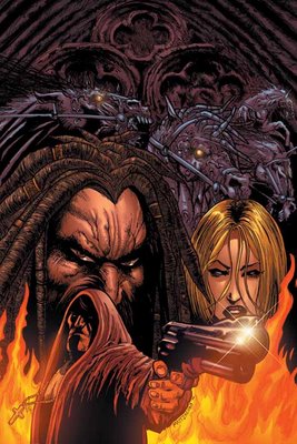
NOT SCRIPTING!!!!
Woohoo!!!
This should rule.
___________________________________________________
WITHBLADE #100 COVERS!!!
Why, oh why, dont exclusive contracts prevent stuff like THIS?!?!

Yuck.
Oh, wait, Silvestri is jealous! He wants to match Turner! Does he?
Does he?!?
......
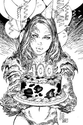
HE DOES!!
Good for you, Silvestri!
Uh, on Joe Linser is trying!
Does he make it?!?!

NO!!
He does NOT!
Foolish Linser, you cant give women actual believable waists!!
Now, the consolation rounds!!!
First up, Gonzo!

I have nothing to say about that.
That is just...WEIRD!!
Finally, artist emeritus, Mike Choi...

Not bad, Choi. No wonder hes leaving.
___________________________________________________
TOP FIVE COVERS!!
___________________________________________________
5. I have to give them credit for this Casanova cover...

Gabriel Ba really pulls off the "skimpy outfit while still looking cool" design.
___________________________________________________
4. I think Ryan Ottley should pay attention to what Charles Adlard is doing on Walking Dead covers...

Thats a really interesting cover.
___________________________________________________
3. I dont know exactly what that is that Adam Hughes is drawing on this 24/7 collection cover...

but it is awesome looking!
___________________________________________________
2. Yes, its about a year past any relevance....

but Ill be damned if that isnt a sweet cover by JG Jones for Savage Dragon.
___________________________________________________
1. Its Frank Espinoza.

Unless someone else steps up, he gets this spot automatically.
___________________________________________________
Okay, thats it for me, folks!
Feel free to share YOUR prejudices!!
AND your top five choices!
Read More
Available link for download